
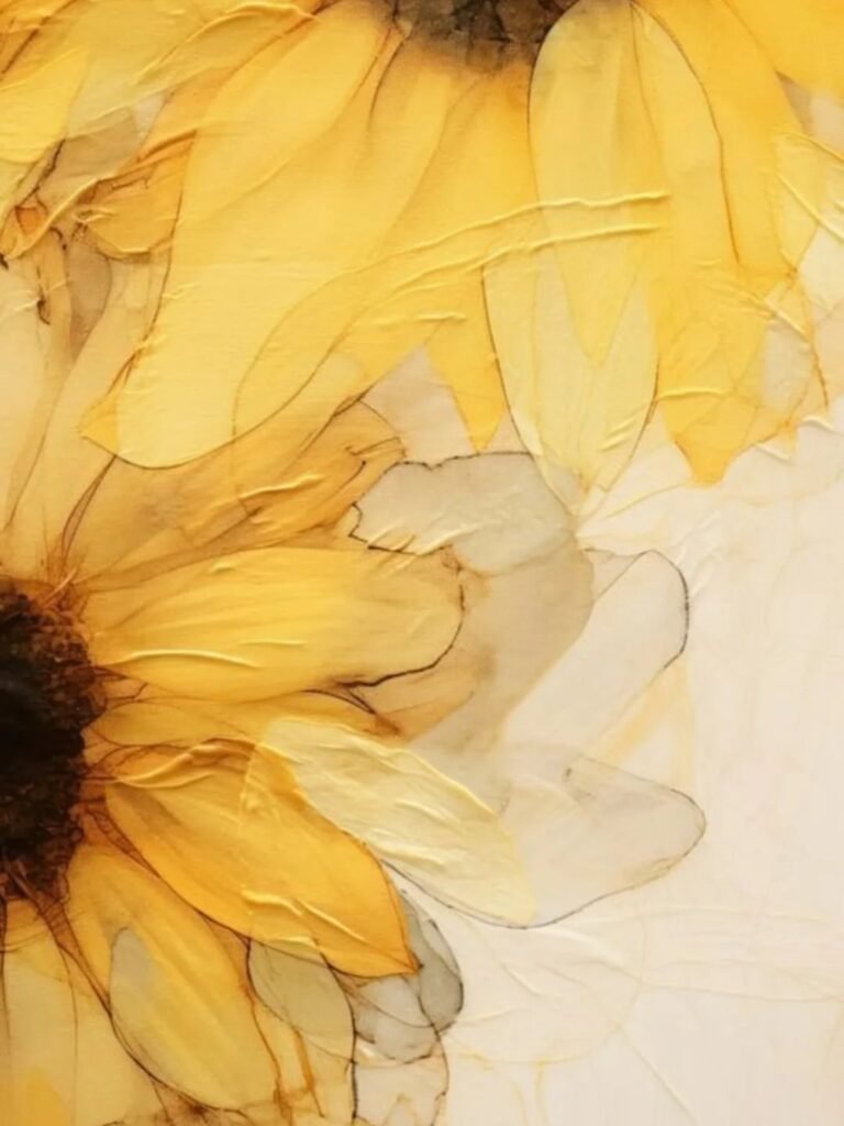
The 9 wallpapers below run from free bundle downloads to battery-taxing live photos, and the one you land on depends on whether your phone spends more time on a conference table or in a dark bedroom before sleep.
A wallpaper that picks up one color from your case keeps the phone feeling like one designed object instead of two things that happened to land on the same desk.
1. Cute IPhone Wallpapers
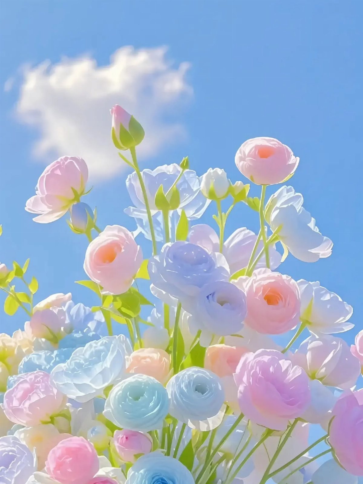
A solid starting point for anyone who wants options without hunting across sites. Free collections bundle flowers, animals, and soft color fields into one download page, which saves the trouble of opening a dozen tabs to compare.
I check the resolution before saving. iPhone screens vary, and a 1080p image stretched to fit looks softer than one sized for your model. Most sites list compatible dimensions; if they do not, pinch to zoom on the preview.
Blur means skip.
This suits the reader who changes wallpapers monthly and wants variety without cost. The downside is curation: you will scroll through some generic picks to find the one that sticks.
2. Cartoon Characters Wallpapers
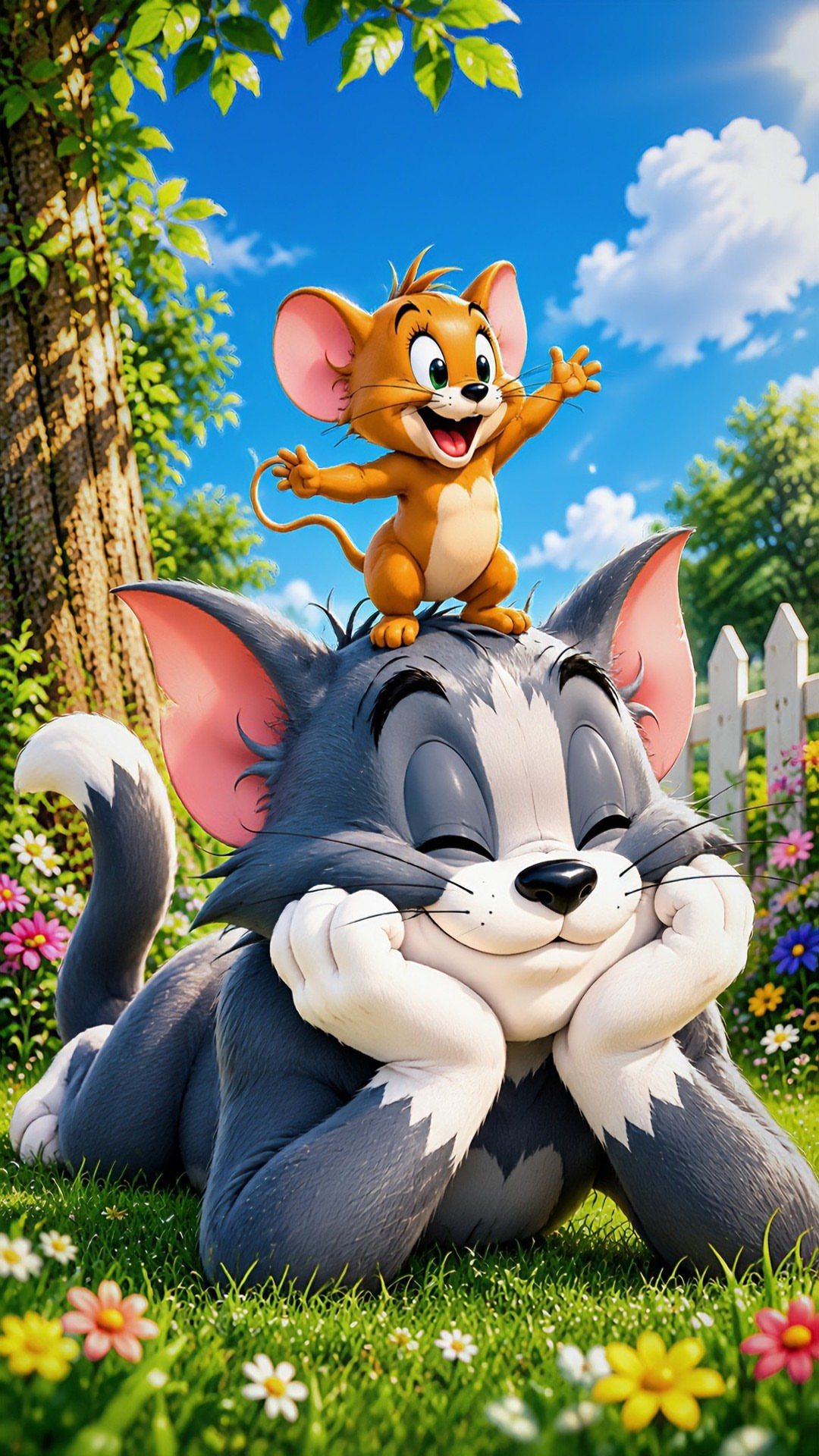
Tom and Jerry in a garden scene hits a specific nostalgia that plain cute cannot touch. Classic cartoons carry built-in recognition; the wallpaper starts conversations without the owner saying a word.
Licensing matters more here than with original art. Official studio releases print sharper and update more often, but fan renders sometimes color outside canon in ways that work better on a small screen.
I lean official for lock screens, where I see it 80 times a day and crisp edges matter.
This choice trades subtlety for personality. It reads young, which works for students and casual workplaces, less so for client-facing roles where the phone sits on a conference table.
3. Cute Anime Characters Wallpapers
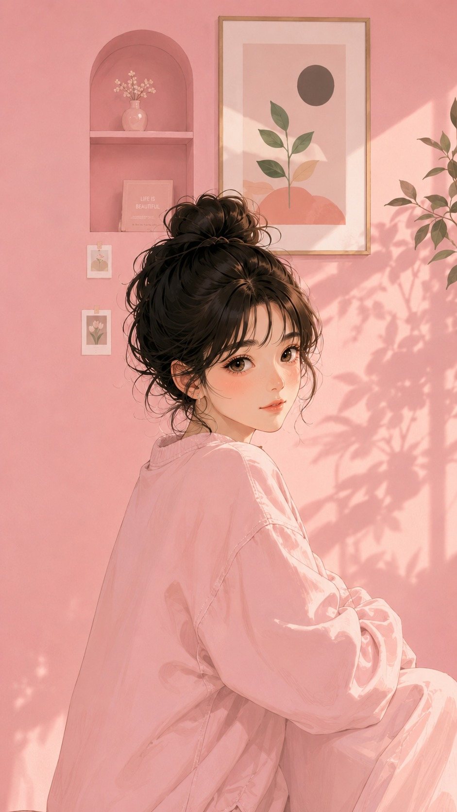
Kawaii culture runs on pink palettes, rounded proportions, and details that reward close looking: a messy bun, a small shelf, botanical prints arranged with care. The style reads as gentle rather than childish, which broadens who can use it.
Anime wallpapers divide between screenshot reuse and original illustration. Screenshots carry scene context; original pieces like this one stand alone as pure aesthetic.
I prefer originals for home screens, where app icons already compete for attention and busy backgrounds turn chaotic.
The soft pink room in this style pairs well with iOS widgets in matching tones. Set one accent color and let the wallpaper do the rest.
4. Floral Patterns Wallpapers
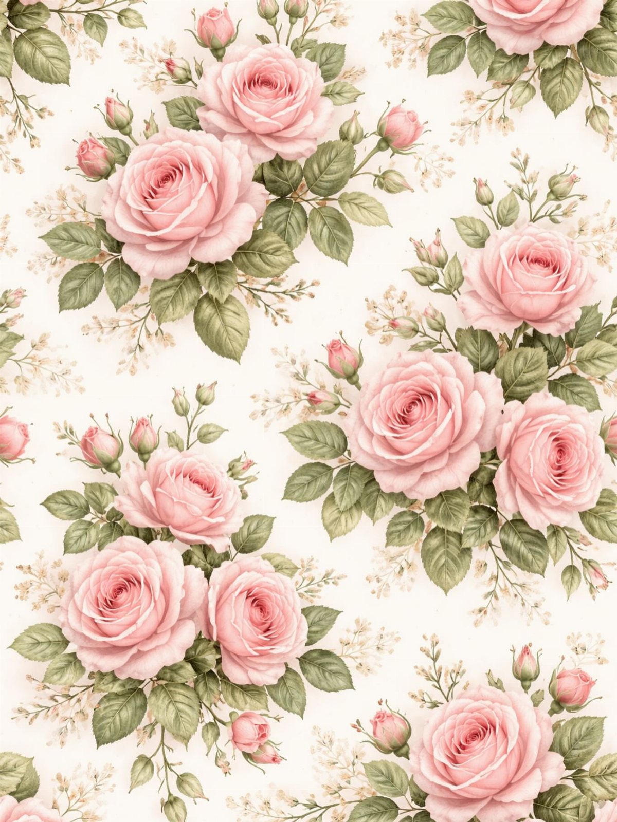
Vintage botanical roses repeat at a scale that stays readable behind app icons. The cream ground and soft pink keep contrast low, which matters for text legibility if you run light-mode apps.
Pattern density is the choice here. Tight repeats read as texture from afar; open spacing lets individual blooms read as illustration.
I pick tight for home screens with many apps, open for lock screens where the image gets center stage.
This style ages better than trend-driven picks. A floral from a few years back still looks right now, which I cannot say for some neon or meme-based options.
The feminine label sticks, though the palette works for anyone who likes quiet color.
5. Kittens and Puppies Wallpapers
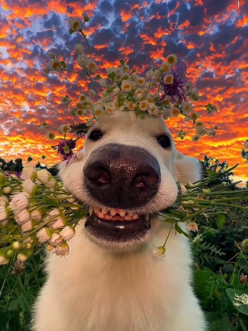
Animal wallpapers bank on emotional response; studies on cortisol drops from looking at pets are solid enough that some hospitals hang photos in waiting rooms.
Live photos add motion here: a puppy tilting its head or a kitten batting a toy. The battery cost is noticeable on my phone, which I accept for lock screen use and disable on home screens where I need longevity.
This category skews broad and sentimental. For something more graphic, search breed-specific line art or silhouette versions.
Same subject, different register.
6. Pastel Wallpapers
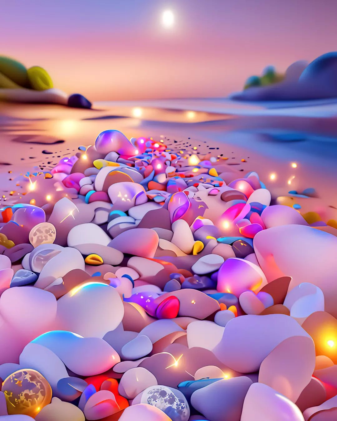
Pastel pebbles on a beach at twilight solve a specific problem: bright wallpapers that look good at full noon and late in a dark room.
The glowing quality comes from soft color value, not high saturation, so eyes adjust without shock.
Color temperature shifts by hour, and pastels stay in the readable middle. Blue-leaning versions feel cooler, peach versions warmer; I match to my case color so the phone reads as one object when I set it down.
The calming claim holds up for lock screens, the first thing seen on pickup. For home screens, test whether your app icons pop against the chosen shade.
Yellow folders on peach, for instance, disappear.
7. Nostalgic Vintage Wallpapers
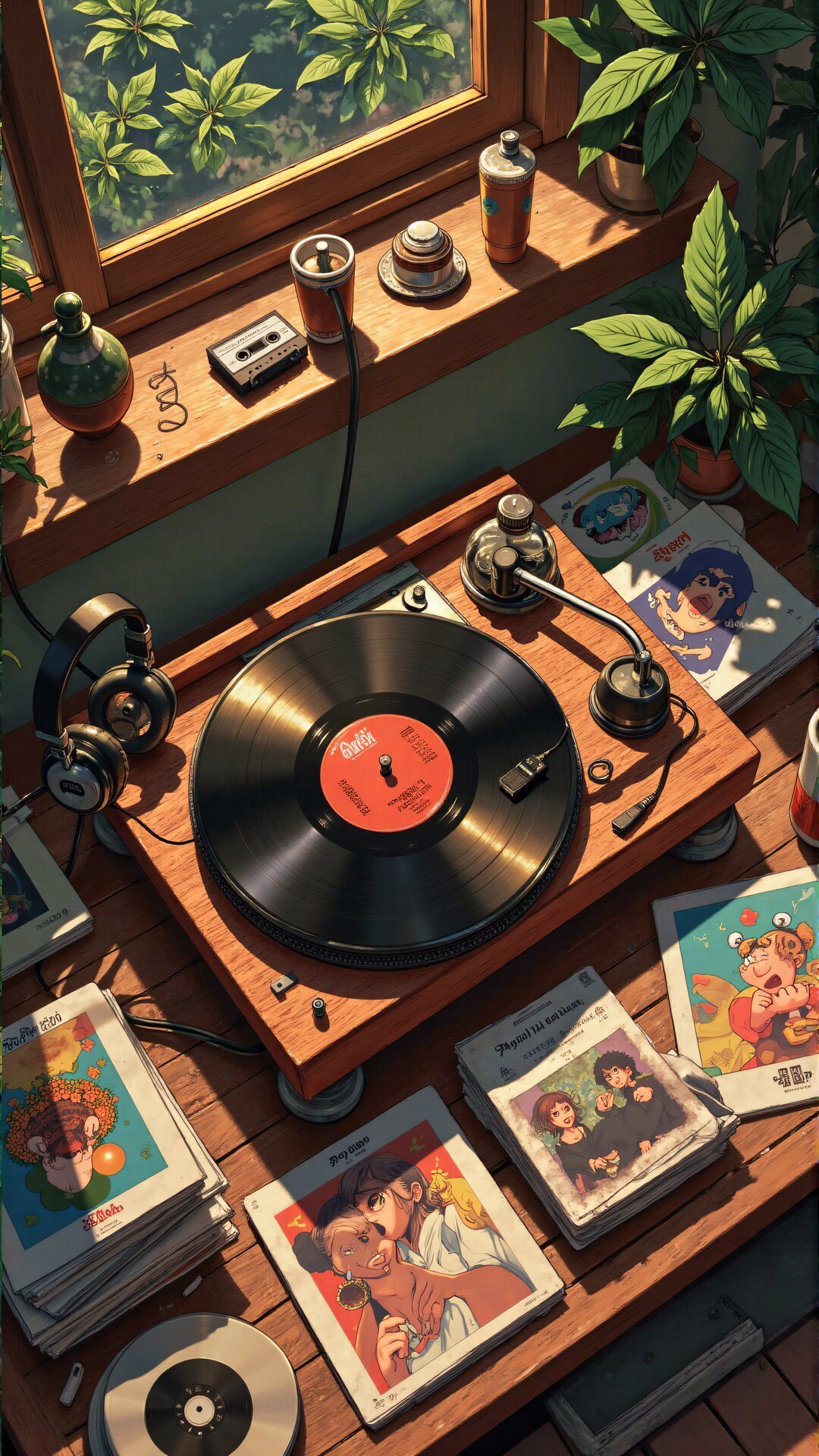
A vintage turntable on wood grain carries the whole mood: browns, amber light, the soft clutter of magazines you supposedly read. The wallpaper works because it hides the clock and the battery percentage behind something warmer.
For a phone you check 80 times a day, this palette matters more than the objects. Cream backgrounds read cleaner than true beige; too much orange and the icons get lost.
I would keep the plants in, lose the cassette if your home screen runs crowded.
The look suits anyone who wants their phone to feel like a room rather than a tool. Tradeoff: true vintage scans can turn muddy at lock-screen scale.
Illustrated versions hold up better.
8. Cute Animal Doodles Wallpaper
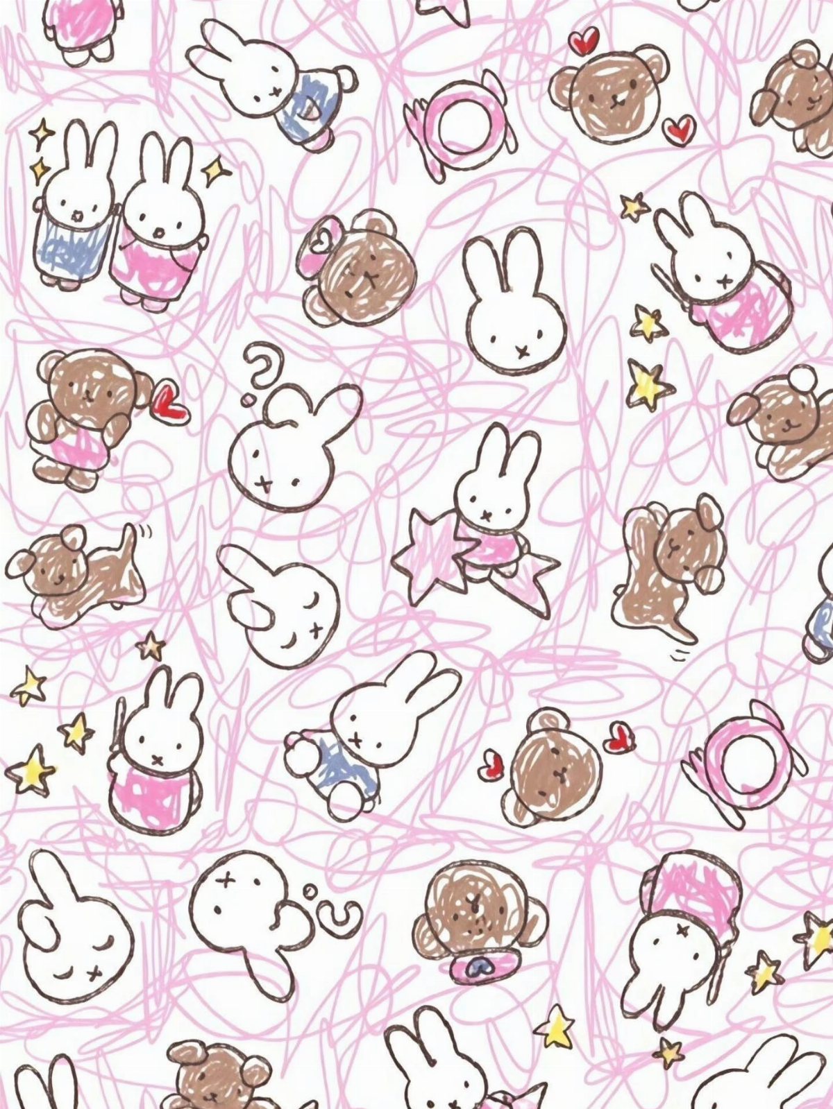
Scribbled backgrounds read as texture, not mess, when the lines stay one color and the characters stay simple. Rabbits and bears in two or three colors keep the pattern from fighting your app icons.
This style lives or dies by line weight. Too thin and it disappears behind folders; too thick and the doodle turns corporate.
Pink on white keeps the icons readable without fighting for attention.
Yellow stars are the detail that makes it feel found rather than designed. I would skip this one if your most-used apps run neon icons; the soft palette clashes hard with saturated reds and greens.
Better for a home screen kept minimal.
9. Illustrated Autumn Pumpkins Wallpaper
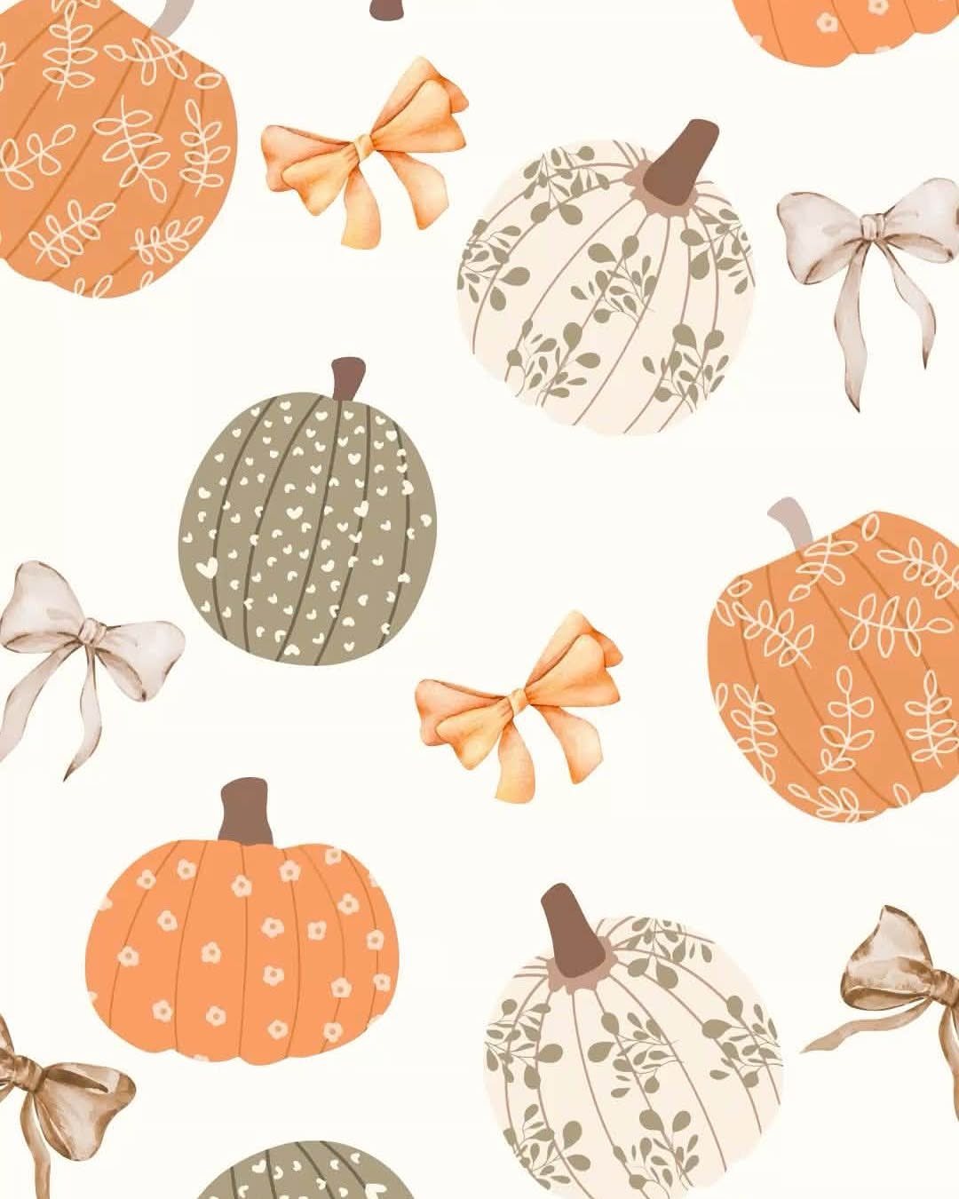
Pumpkin wallpapers usually arrive too late, the week before Halloween, then feel expired by November 5. The illustrated route fixes this: sage green and cream read as harvest, not holiday, and the bows keep it from tipping into Thanksgiving territory.
A pattern that repeats cleanly avoids the jarring jump when you tilt the phone. A single large pumpkin shifts awkwardly when you tilt the phone; scattered small ones stay composed.
Check your iOS settings: "Still" wallpaper locks the image, "Perspective" lets the pattern breathe.
I would use this from late September through the first frost without updating. The trade is specificity; anyone wanting spooky or cozy will need to swap out sooner.
For general autumn mood, this range of color wins.
How to Download Wallpapers
Saving a wallpaper to your phone is straightforward. Tap the image and hold until the menu pops up, save it to your camera roll from there.
Check the dimensions before you set it.
I save images to a dedicated album so they do not get buried under screenshots. When you change wallpapers often, that 10 seconds of sorting pays off.
Using AI for Wallpapers
Some sites now run AI tools that build custom wallpapers from text prompts. You describe a scene, pick a style, and the tool generates a unique image sized for your phone.
I have mixed AI output with edited elements to get results neither could manage alone. The AI handles backgrounds and atmosphere; manual work sharpens focal points and fixes odd details like extra fingers or blurred text.
Free tiers on these tools usually cap daily generations or watermark the output. Paid AI tiers are priced low enough that a lock screen you check dozens of times daily starts to feel worth it.
Worth it if you change wallpapers weekly and want no chance of matching a stranger’s phone.
Aesthetic Themes
The labels people use for wallpaper styles map onto broad aesthetic territories.
These labels help search, but the best pick usually crosses two. A floral in kawaii color reads gentler than either parent style; vintage framing on a pastel ground suits moods that pure nostalgia overdoes.
I would skip the label entirely and search by color value instead. "Soft pink room" finds the mood faster than "aesthetic" most days.
Personalization Tips
Your wallpaper is the one visual choice you make about your phone that no app overrides. The icons stay fixed; the widget shapes are Apple’s.
The background is yours.
Match it to something you already own. A case color, a bag, a nail shade you keep returning to.
The phone reads as intentional when the tones align, accidental when they clash.
I test a new wallpaper for a full day before committing. Morning light, fluorescent office, late-night dim: three checks, and if it fails any, I swap.
It takes half a minute to set, and after that the screen matches wherever you open your phone.
For readers who change with mood or season, keep a small album of tested favorites. Curation beats scrolling when you need a fast refresh.
Frequently Asked Questions
What are the top most popular wallpapers?
Floral patterns, kittens and puppies, and pastel color fields show up most often in free collections. These three have staying power: florals age better than trend-driven picks, animal images carry proven calming effects, and pastels stay readable in any light.
Cartoon characters and anime originals also rank high for anyone who wants personality over neutrality.
What are the best iPhone wallpapers for 2026?
Soft pink palettes, vintage botanicals, and illustrated autumn themes in sage green and cream are the directions current collections favor.
The pink room aesthetic pairs cleanly with iOS widgets, while harvest-toned patterns work from late September through first frost without feeling dated. Always check resolution against your specific iPhone model before saving.
Where can I find cute wallpaper?
Free collections bundle flowers, animals, and soft color fields onto single download pages, which saves opening a dozen tabs to compare.