
These twelve hot pink backgrounds run from a free scrap of frayed cotton to a painted wall that takes primer and a Saturday.
The right one depends on whether you need your screen, your wall or your invitation to do the work. Satin catches light at every fold and reads almost magenta where it pools; matte cotton keeps your calendar notifications readable instead.
1. Solid Hot Pink Background
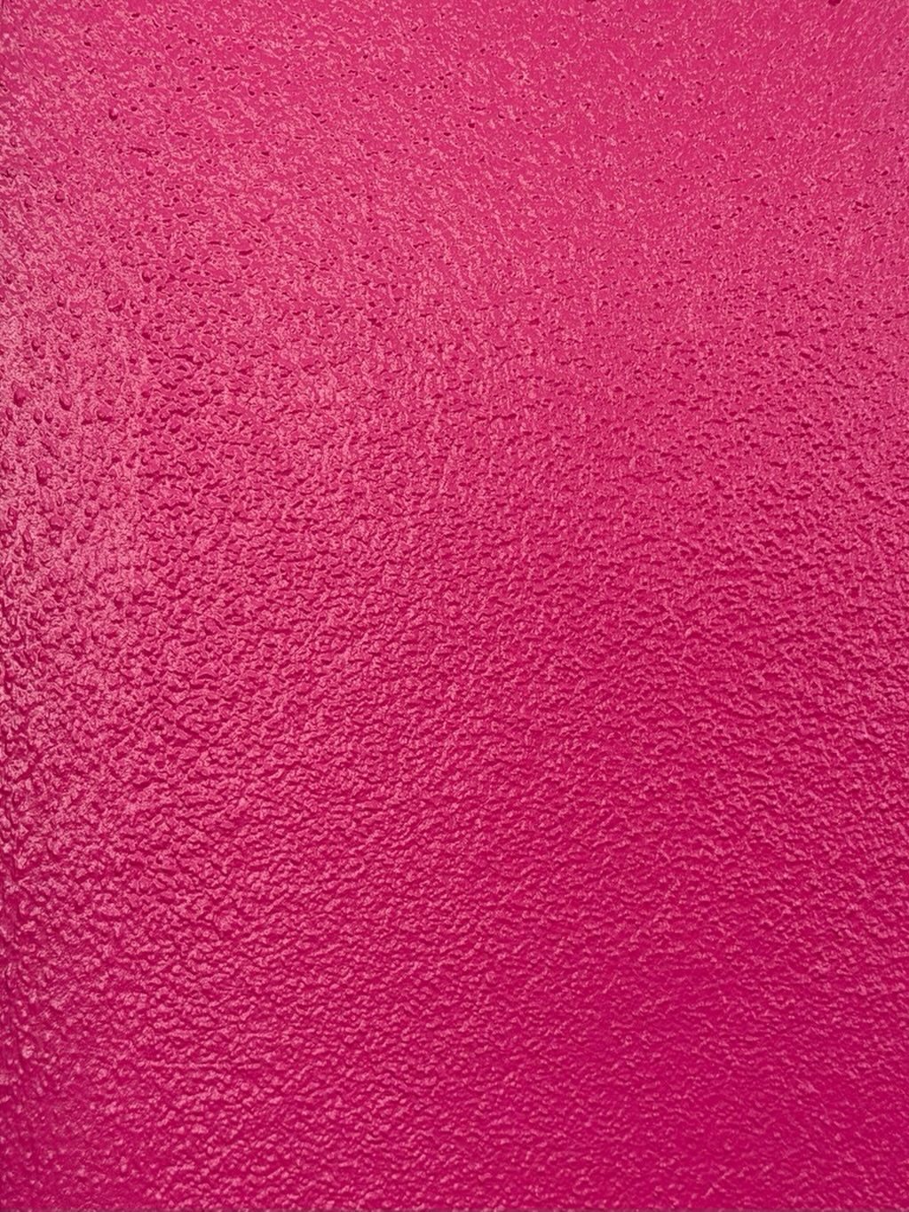
A solid hot pink background gives your screen or wall the same punch as a painted door in an otherwise neutral room. No pattern means nothing competes with your icons, your frames or your furniture.
For a phone wallpaper, the flat color keeps app labels readable. For a party backdrop, it reads as intentional rather than unfinished.
I have seen hosts pair this with black tableware and let the wall do all the work.
Rolled paint on plaster catches light better than a digital flat fill if you want a wall that reads as physical rather than printed.
If you are painting, ask for a sample in semi-gloss; matte hot pink can look chalky under flash photography.
2. Hot Pink Glitter Background

Glitter backgrounds trade everyday practicality for the short window when you actually need something to feel like an event.
Heart bokeh comes from shooting actual lights through a shaped lens filter, not from the glitter itself, which is worth knowing if you want to recreate the full effect.
For a phone lock screen, the sparkle reads as texture from arm’s length but can feel busy up close.
I would use this for a party photo booth backdrop or a birthday invitation header, where the shimmer has room to read as glamour rather than noise.
The layered look in some versions mixes light pink halftone dots behind the hot pink glitter. That extra layer adds depth if you are designing digitally; in print it can muddy.
3. Hot Pink Leopard Print
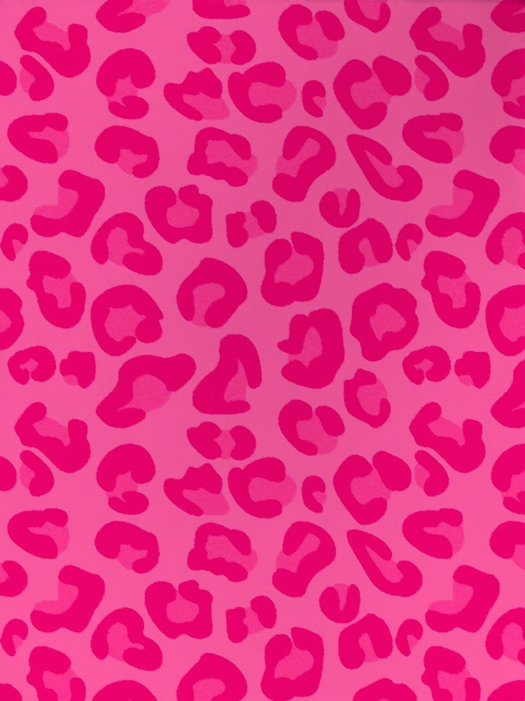
Leopard spots in hot pink read playful in a way that black and tan never could. Keeping the spots flat and graphic keeps leopard print from tipping into costume territory.
Scale matters more here than in most patterns. Small spots like these work on a phone screen; at wall or banner scale they turn to mush.
For a backdrop, I would look for a version with fewer, larger spots spaced farther apart, or stand closer to the print than you think.
The Hello Kitty variation with glitter lips exists if you want to commit fully to Y2K nostalgia. For adult gatherings, the plain spot version lets you add your own accessories without competing.
4. Hot Pink and Black Stripes
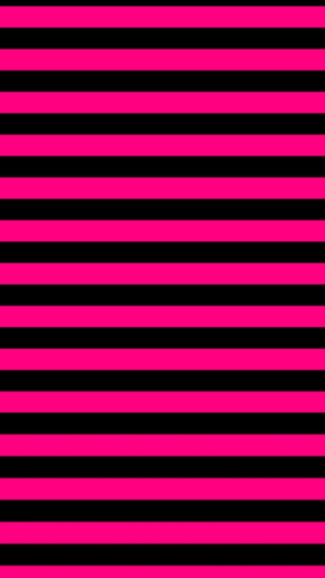
Stripes of hot pink and black carry immediate visual rhythm; your eye cannot settle, which makes this a strong choice for anything meant to hold attention for seconds, not hours.
Horizontal stripes widen a space visually, while vertical stripes would stretch height.
For a digital background, narrow stripes at screen resolution stay crisp; in print, fine stripes risk moiré patterns when photographed. Wrapping paper that doubles as table runner is exactly the kind of shortcut worth keeping in mind for this pattern.
The zebra variation swaps pink for white in the same layout; it reads harder, more nightclub than party.
5. Hot Pink Hearts Background

A tunnel of neon hearts solves a problem most romantic backgrounds create: they sit flat. The receding scale gives you depth without requiring 3D glasses or a VR headset.
For a phone wallpaper, the dark center lands right where your clock sits, which is either perfect planning or happy accident.
The tiny white sparkles read as stars at thumbnail size and as dust if you blow them up too large; keep the original resolution or lose the effect.
I would use this for a Valentine’s Day party invite or a teen sleepover backdrop. For a wedding, the neon edges feel too casual; soften the glow or choose the aura background instead.
6. Hot Pink Aura Background
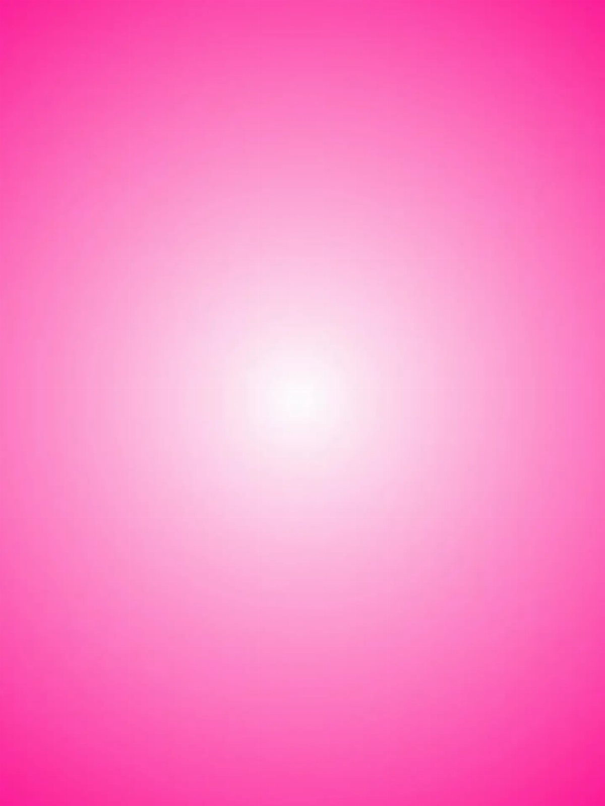
The hot pink aura fades from white center to saturated edge like a blush or a sunset, which makes it the most forgiving background in this list.
Your app icons or your subject’s face lands in the bright middle where contrast stays gentle.
For a calming aesthetic, the radial gradient works because it has no hard lines to track. Portrait orientation suits phone screens; rotated to landscape the white center shifts and the balance changes.
I have seen this as a Zoom background that flatters skin tones, and as nursery wall paint that keeps a room from feeling too themed as the child ages.
The effect depends on smooth blending; banded prints look cheap, so check your file quality before sending to print.
7. Hot Pink Satin Fabric

Satin catches light at every fold, so a phone screen stays interesting even when you aren’t looking at anything on it.
Satin hot pink reads almost magenta where it pools and brighter pink at the crest of each wave, which works for lock screens that get glanced at from angles.
To get this as a digital background, photograph actual satin in window light rather than downloading a texture; the slight unevenness keeps it from looking like a stock render.
Pull the fabric tight at the top and let it fall naturally.
I’d use this for a home screen with minimal icons, since busy apps fight the shine.
8. Black Lace Over Hot Pink
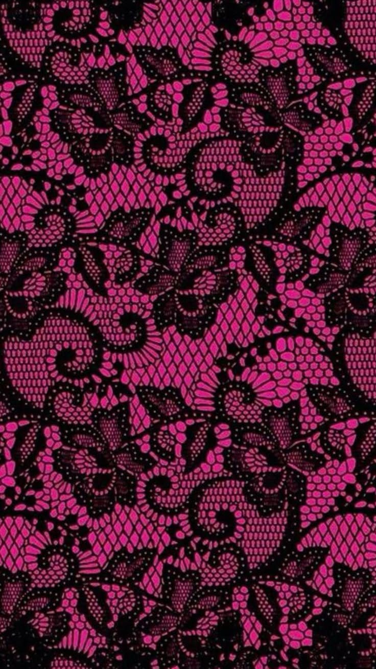
Lace over hot pink is what I would have picked at 16 for a bedroom wall, and I would have been right.
Black floral lace with enough negative space lets the pink read as the main event, not the accent, which keeps it from feeling like a Halloween decoration.
Fine mesh with swirling motifs is one route; quilted fabric with heart accents or studded diamond patterns are alternate routes if you want structure instead of romance.
All three show up in preppy wallpaper tags, so the idea has staying power beyond the Y2K revival.
This one suits a reader who wants feminine without soft. The lace carries all the pattern, so the rest of the design stays minimal.
9. Draped Matte Hot Pink Fabric
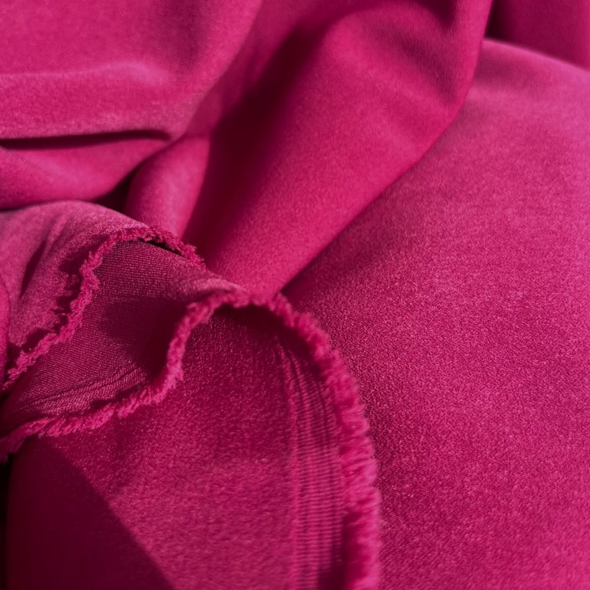
Matte fabric with a frayed edge is the opposite of the satin entry, and that contrast is what makes it worth including. Where satin demands attention, this one recedes enough that app icons and calendar notifications stay readable.
The visible weave and soft shadows come from cotton or linen, not synthetic drape.
To shoot your own, fold the fabric loosely rather than styling precise pleats; the casual geometry is what separates this from catalog product photography. The frayed edge is doing aesthetic work, so leave it untrimmed.
This is the background for someone who wants color without performance. It costs nothing extra beyond the fabric scrap, and it ages better than anything glossy.
Aesthetic Uses of Hot Pink
Hot pink works in fashion when it reads as deliberate, not accidental. A solid flat color under black tailoring keeps the look adult; lace overlays or floral swirls push it toward romantic territory that needs simpler accessories to balance.
In home decor, the same color on four walls overwhelms faster than on a screen or a garment, which is why painted doors, backsplashes or single accent walls carry it better.
Digital design lets you test intensity before committing.
A hot pink background on a phone screen at full brightness at 10 PM is a different experience than the same file viewed at noon; the color does not change, but the eye’s adaptation does.
For branding, the flat fill keeps logos in black or white readable without competing for hierarchy.
Trends in Pink Backgrounds
The current mix layers several effects that used to stay separate. Leopard spots share space with glitter logos, skull silhouettes and floral motifs in collages that read as Y2K revival rather than any single source.
A white center that softens into saturated edges gives the eye somewhere to rest when busier compositions feel like too much.
Animal prints in hot pink stay graphic when the spots are larger and fewer; the smaller, denser versions that fill a phone screen turn muddy at poster scale.
Glitter effects that work as texture at thumbnail size need the same scaling check: what reads as shimmer on a phone screen reads as noise blown up to poster dimensions.
The combination of all three in one file is common now; whether it holds together depends on which element dominates.
Applications for Hot Pink Backgrounds
Social posts using these backgrounds gain stopping power, though the same flat color in a feed of mixed content risks reading as an ad unless the subject breaks the frame.
Event decoration is where scale shifts matter most. A digital file at 1080p blown up to banner size shows banding in gradients and moiré in fine stripes; test at final size before printing.
For backdrops that guests photograph, matte fabric photographs more evenly than satin under flash, and lace overlays need distance to read as pattern rather than solid gray.