
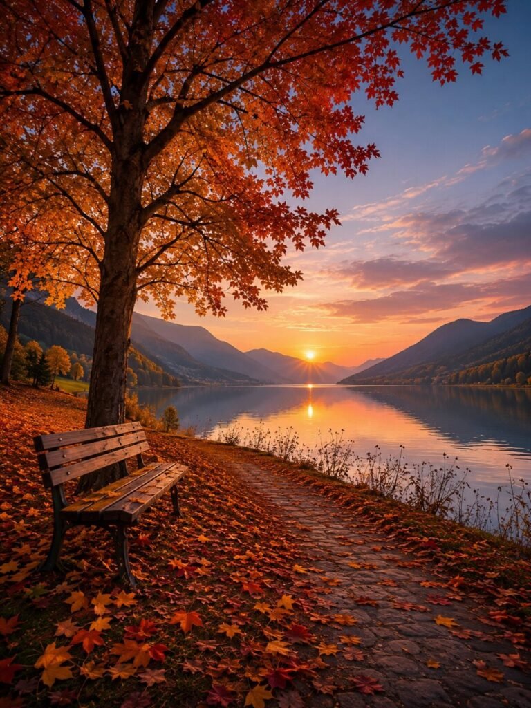
These fourteen fall phone backgrounds run from hand-drawn leaf details to full forest paths, and the one that fits your phone depends on whether you need calm behind dense app folders or a bold seasonal statement on a mostly empty lock screen.
OLED display quality separates the ruby-and-gold leaf shots from the monochrome yellows that still read true on older screens.
1. Coffee and Candles Fall Phone Backgrounds
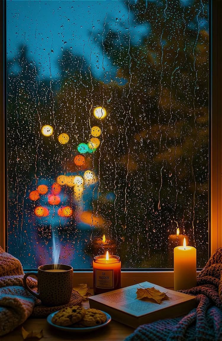
Nothing beats that Sunday morning feeling: rain on glass, something hot in your hands, nowhere to be. These wallpapers compress that mood into a single rectangular screen.
The color story matters more than the exact objects. A navy or charcoal background reads cozier than true black; amber candlelight and cream foam pop against it.
I gravitate toward images with visible texture on the textiles, not the smoothed, stock-photo version. The slight blur of condensation or city lights behind the glass adds depth that flat arrangements miss.
Save the full-resolution file and test it at night. A too-bright candle flame or blown-out window will keep you awake every time you check your phone after dark.
2. Falling Leaves IPhone Wallpapers
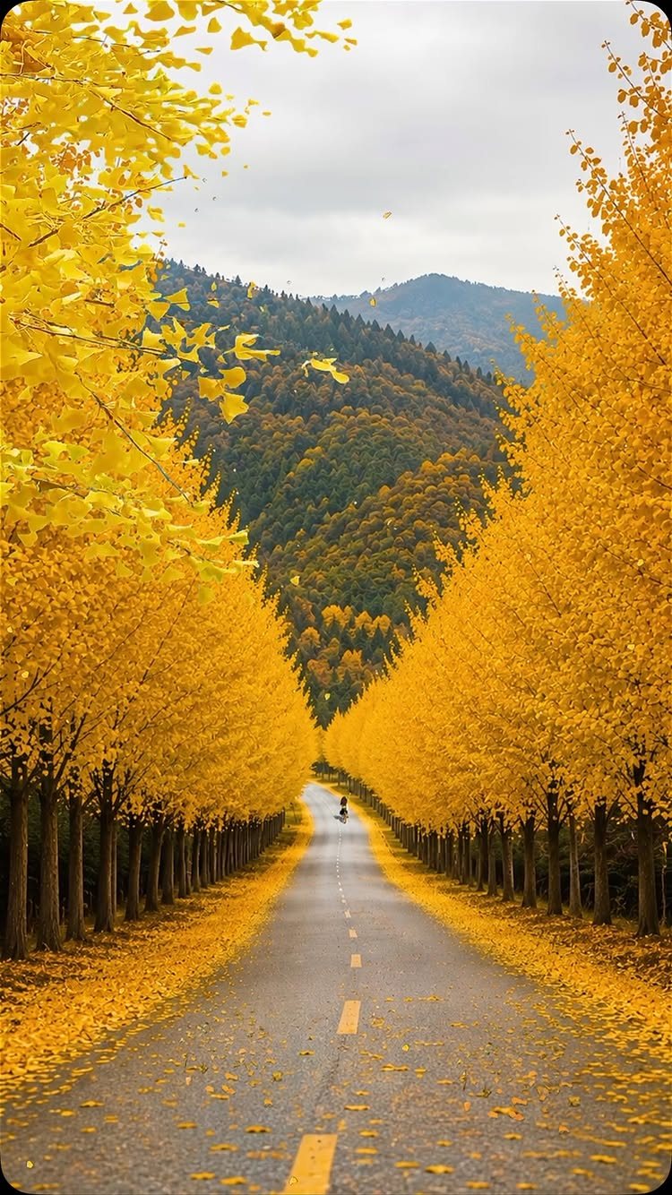
Yellow ginkgo against grey sky carries the whole season in two colors. This is the wallpaper for people who want autumn without the pumpkin-spice packaging.
Monochrome yellow works on older screens with less color accuracy; the ruby-and-gold combinations need OLED to read as rich rather than muddy. Check your phone’s display spec if you are unsure.
I’d pick this for anyone who switches wallpapers often. The limited palette keeps it fresh longer than busier scenes.
3. Forest Paths with Foliage
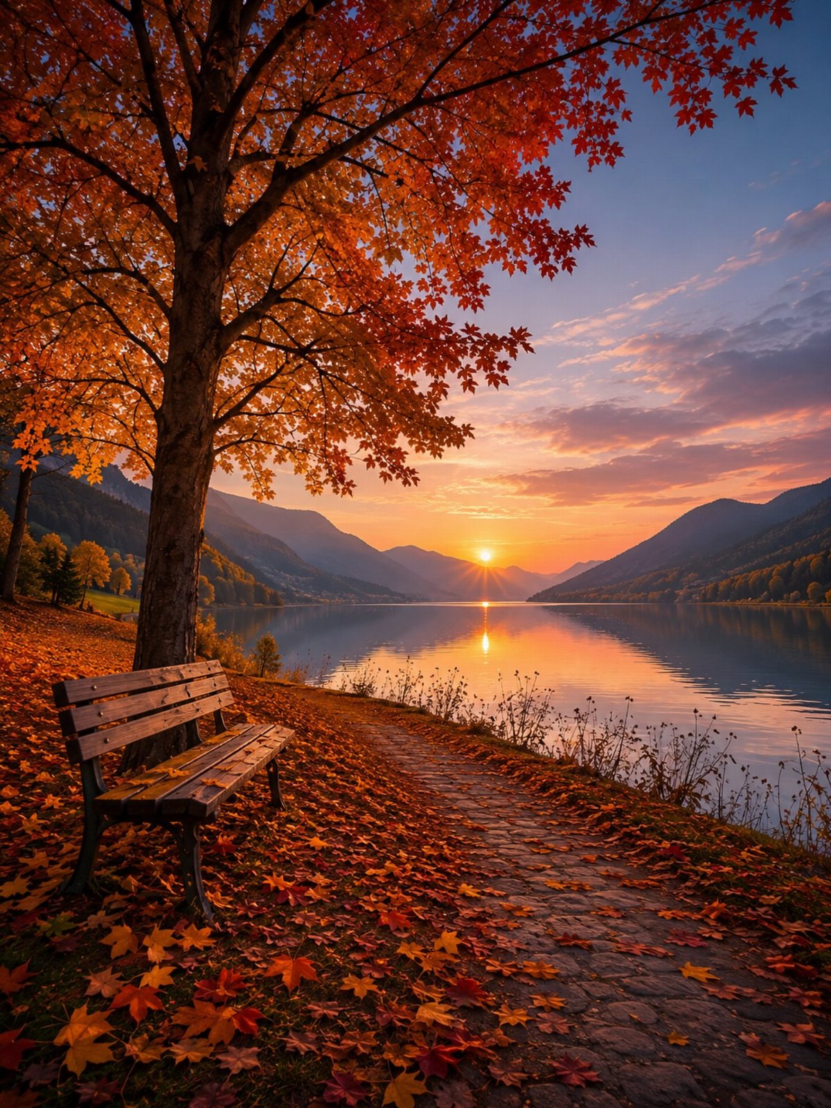
The bench facing water is the invitation: sit, stay, let the afternoon pass. These wallpapers borrow from landscape painting more than snapshot photography.
Depth of field is the technical detail that separates usable from good. The path and foliage need mid-level sharpness; the distant ridge or mountain should dissolve.
Those overlapping layers of color give your thumb something to travel through each time you open your phone. Mist adds this automatically, so morning-after-rain shots outperform clear-sunset versions for daily use.
File size can climb fast in fog-heavy images. Check whether your chosen source offers a compressed phone-size option, or bring the full 4K version into your photo editor and crop to your screen ratio before setting.
The pixel savings matter if storage stays tight.
4. Woodland Creatures Among Fall Leaves
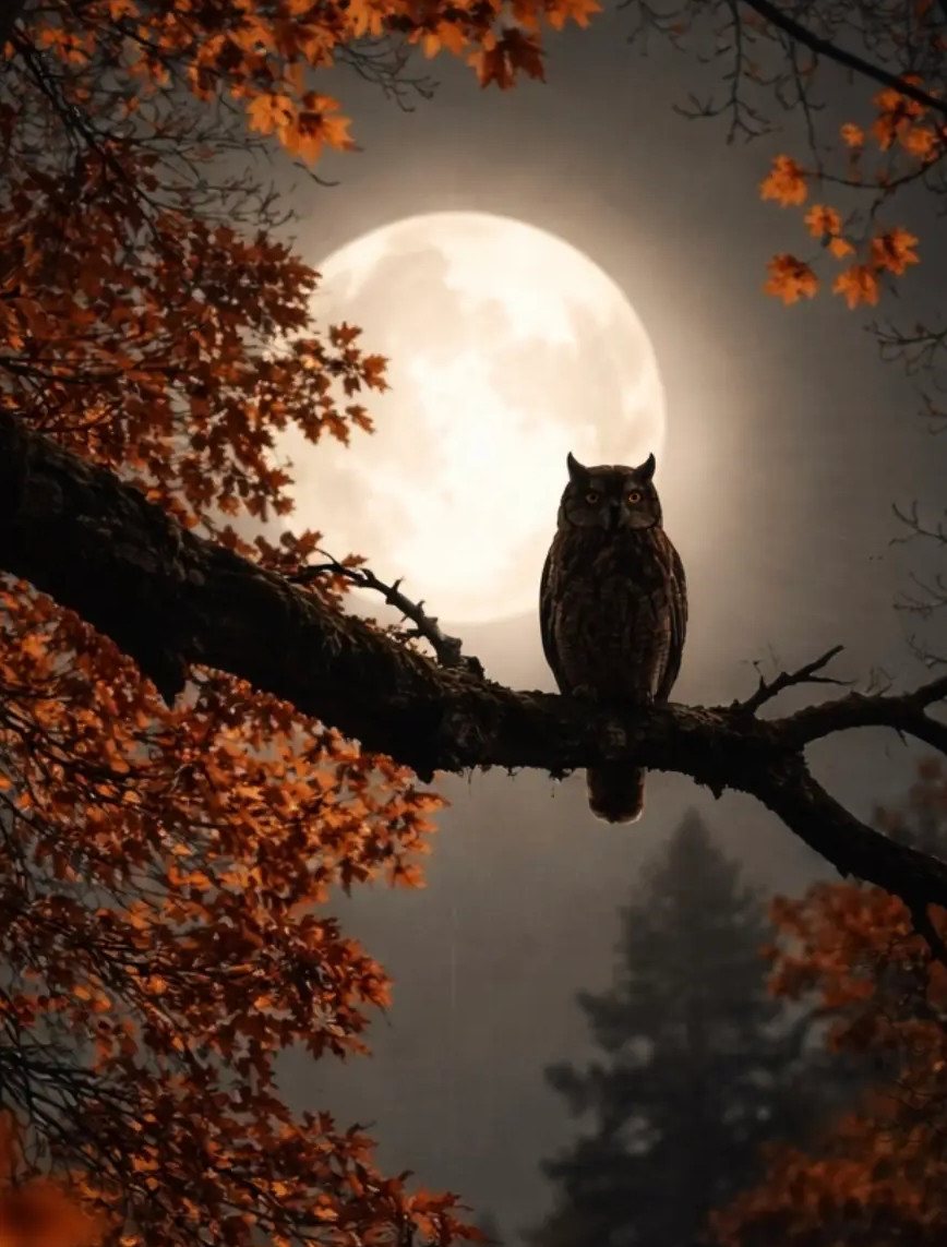
Owl-and-moon compositions read as Halloween to some, autumn to others. The threshold is orange leaf density: the more vivid foliage framing the creature, the wider the season stretches.
I’d keep these on the lock screen rather than the home screen, where creature faces compete with too many app icons.
The centered focal point, usually the animal’s eye or the moon, competes less with notification text and app icons at small scale. Deer in meadow grass work better for home pages; the lower horizon line leaves functional space.
Squirrel portraits read younger, more September classroom than October evening, so they suit phones used by kids or anyone who keeps their autumn light.
Zoom matters. A cropped tight portrait loses habitat context and becomes generic animal wallpaper.
The extra padding around the frame that looks like waste on desktop is what makes it read as seasonal on a phone.
5. Hand-Drawn Elements
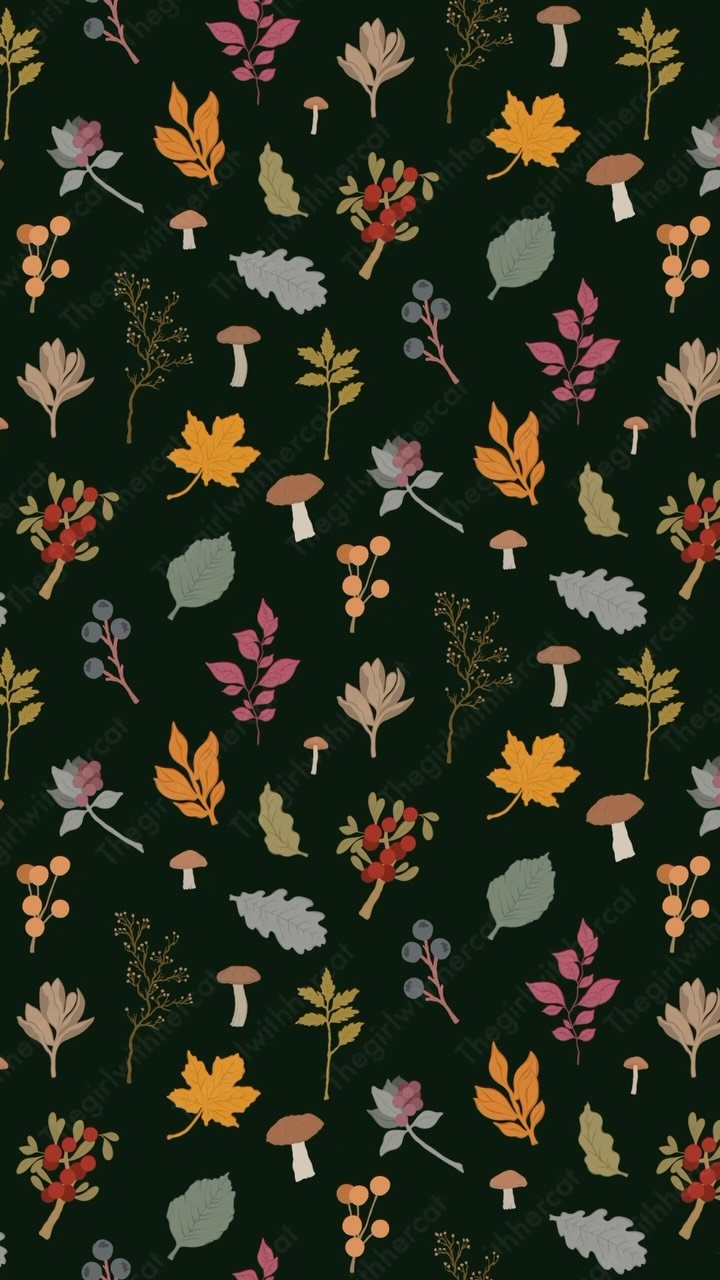
Hand-drawn wallpaper ages slower than photography. The slight irregularity in a leaf outline or a mushroom’s cap shadow signals care, which means it does not register as dated as fast as a photo tied to a specific year’s color trend.
Dark green backgrounds like the visible version are harder to source than cream or tan, but they solve two problems: they hide notification clutter, and they read as intentional rather than unfinished.
The warm earth tones, orange through muted grey, need to carry enough saturation against that depth. Test by dimming your screen halfway.
If shapes blur together, the contrast is too low for actual use.
Pattern scale is the choice the source rarely shows you. A repeat that looks delicate on a monitor will read as busy and repetitive on a phone screen.
Cropping to a single motif, off-center, often wins over tiling for phones.
6. Minimal & Moody Styles
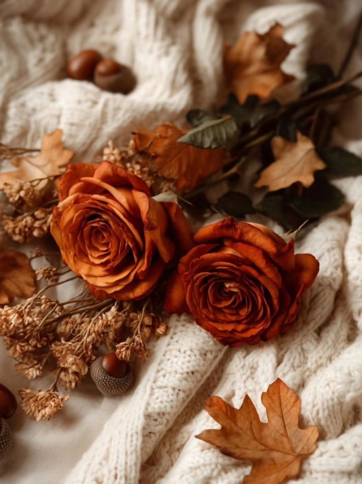
Two stems, a handful of dried material, and an expanse of knit: this is Negative space as wallpaper subject. The burnt orange carries meaning only because there is so little of it.
These suit readers who keep app-heavy home screens. The white or cream ground functions as camouflage behind icons; the color concentrates at screen edges where fewer apps sit.
It’s the opposite strategy of busy pattern, and it fails if you prefer dense folders or widgets stacked mid-page.
The tactile quality matters more here than in other entries. A chunky cable knit or ribbed throw photographs with shadow depth that flat weaves lose.
If the source image looks painted rather than photographed, check whether the texture still reads at phone resolution. Some illustration flattens knit into generic grey.
I’d pick this for someone who keeps one wallpaper through December. The mood carries into winter more honestly than leaves or pumpkins do.
7. Golden Autumn Trees in Nature
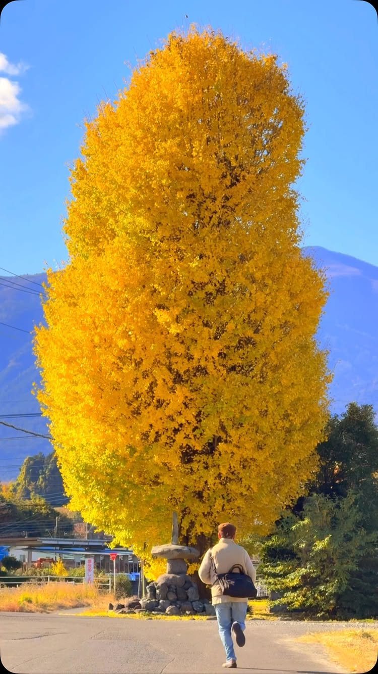
A single blazing ginkgo against cold blue mountains gives your lock screen the one perfect shot most people never frame themselves. The maker sprinted to catch the light, which tells you exactly how fast autumn gold fades.
This suits anyone who wants a photograph that feels found rather than filtered.
The blue-and-yellow contrast reads crisp on both OLED and LCD screens, and the small human figure gives your thumb a natural resting spot that does not obscure the tree.
Set it as your lock screen, not your home screen; the color density competes with app icons.
I would pick this for the person who rotates wallpapers weekly and wants something that still looks good first thing in the morning before coffee. Photo by Sylvia Lam
8. Cute Pumpkin Patterns
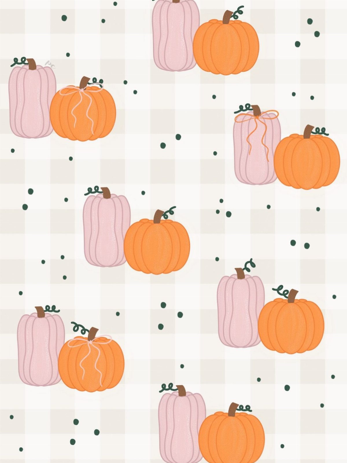
Repeat patterns save your home screen from the visual noise of scattered app icons.
Graphic wallpapers like this one scale better than photographs when you slide between pages or pull down notifications. The color blocking also means you can match your case or lock screen without hunting for exact tones.
I would use this as a home screen behind minimal widgets in cream or moss green. The pink-and-orange pairing feels modern where pure orange can tip toward preschool.
If your icons run dark, this light ground helps you find them faster; if you run light icons, the small green dots give enough contrast at the edges. Photo by Whimsy Soul
9. Fallen Leaf Textures
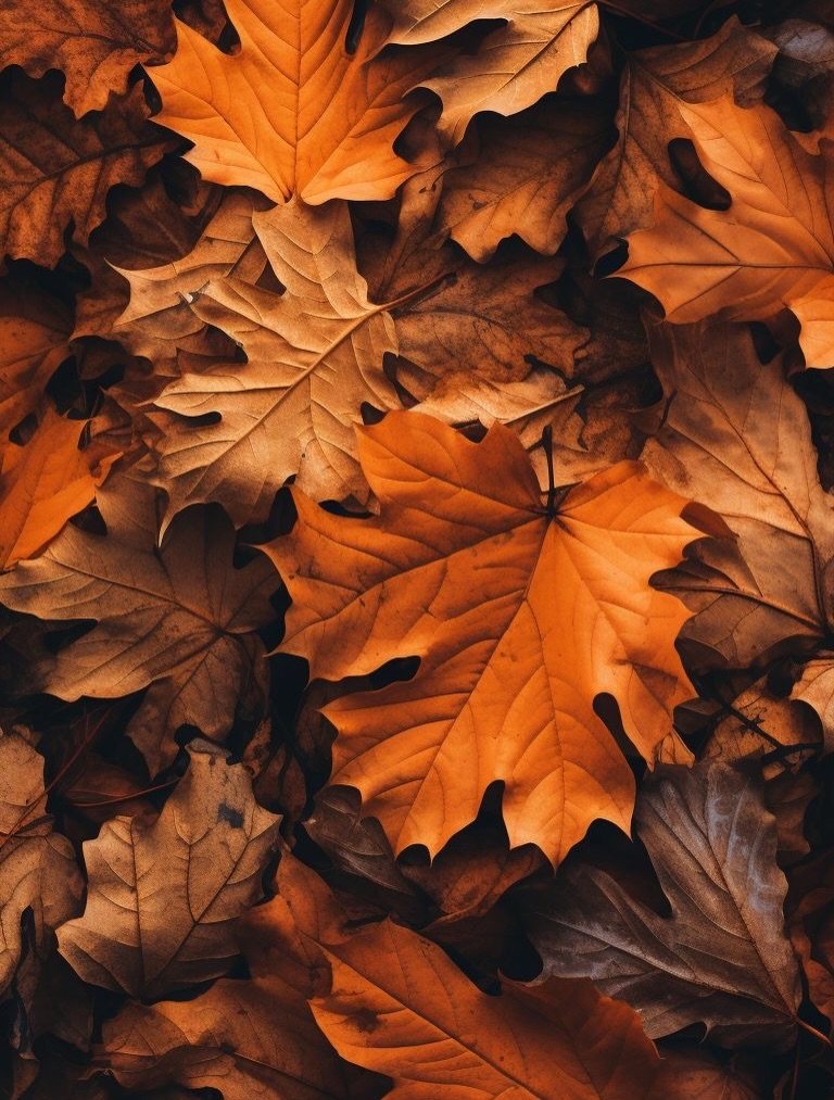
Leaf litter wallpapers hide thumb smudges better than anything smooth or backlit. The layered orange and brown here creates natural depth that flat color cannot fake, and the top-down angle means no horizon line fights your status bar.
This works as a lock screen for anyone who checks their phone in bright sun; the matte density of dried leaves absorbs glare where glossy surfaces reflect it. The warm range also softens the cold shock of an early alarm.
I would pair this with a weather widget in white text and let the organic shapes do the seasonal work without adding more icons.
For home screen use, the texture holds up behind gridded apps but reads flatter; I would keep it to the front of your phone and run something cleaner behind your rows. Photo by World of Printables
10. Cozy Lakeside Scenery
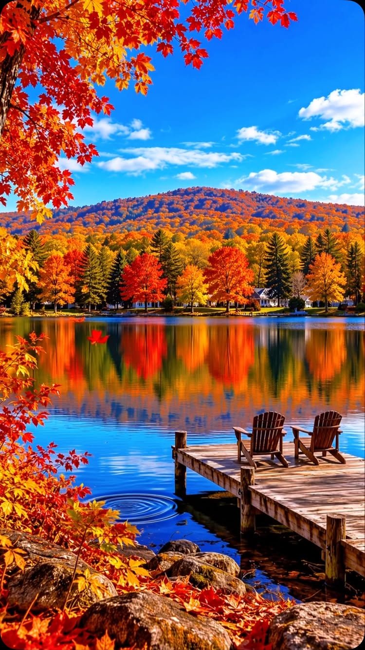
Two empty chairs on a dock say "autumn weekend" without the clutter of mugs, blankets, or staged props. The still water doubles the color, which makes this photograph read richer than single-layer scenes on small screens.
Set it as your lock screen if you want the seasonal cue without the literal pumpkin.
The perspective lines of the dock draw the eye downward, which places your clock and notifications in the calmest zone rather than over busy foliage.
I would not use this behind a home screen heavy with folders; the mountain horizon competes for attention. The pairing works best for someone who keeps a minimal dock and wants the calmest possible unlock experience.
If your autumn mood runs more lake house than apple orchard, this is the one.
How to Download and Use Wallpapers
Tap and hold any image from the collection below to save it to your photo gallery. On iPhone, head to Settings, tap Wallpaper, then Choose a New Wallpaper and pull up the image you saved.
Android paths vary by manufacturer but follow the same logic: long press the home screen, select Wallpaper, then pick from your gallery. Cropping now saves frustration later.
A full-resolution file has more pixels than your display needs, but a small image stretched across the whole screen turns soft.
Test placement before you commit. A clock or notification bubble that lands over a face, a candle flame, or the one bright leaf draws the eye wrong every time you unlock.
Customization Tips
Cropping turns a landscape shot into a phone-focused composition. Remove the bottom third where your thumb will rest, or shift the focal point to account for your clock widget’s usual position.
App icons matter more than most people account for. A busy center fights dense folders; clean edges suit minimal setups.
If you run custom icons in moss green or cream, pull a tone from your wallpaper into the icon border so the whole screen reads as one decision rather than two colliding.
Your phone model changes how color renders. OLED screens handle deep blacks and saturated reds; older LCD panels flatten those same files into mud.
Check your display type if a wallpaper that looked stunning on someone else’s phone falls flat on yours.
Color Palettes That Define the Season
Warm reds, deep oranges, and golden yellows dominate autumn wallpapers for a reason: they signal harvest and fading light without needing a pumpkin in frame. The palette works across moods, from apple-orchard cheerful to bonfire melancholy.
Not every screen shows these tones accurately. The amber that reads cozy on OLED can shift toward brown on LCD panels.
Blue undertones in mountain backgrounds or lake reflections pair with the warm range to keep the eye moving; all-yellow compositions tire faster.
Spooky season overlaps but does not own autumn. The same reds read as cider in September and Halloween in October.
I would pick muted versions if you want the season without the holiday, and save vivid orange-and-black for the 2 weeks before the 31st.
Creating Mood with Fall Wallpapers
Your wallpaper sets tone before you open an app. A fog-heavy forest path slows your pulse on a Monday morning; bright leaf scatter feels more social, more Friday-afternoon energy.
The match to your actual day matters less than the gap you need filled. A hectic schedule benefits from still water or empty chairs; flat energy lifts with pattern and warm color.
I change mine when the season turns, then leave it. The minor friction of a new image keeps the phone feeling considered rather than defaulted, but changing weekly turns the choice into another task.
Pair with widget color deliberately. White text on dark green reads intentional; auto-selected grey looks forgotten.
The mood you build is the sum of ten small choices, wallpaper among them.
Frequently Asked Questions
How do I download and apply a fall phone background?
Most sites and Pinterest boards have a long-press or right-click save option; once it is in your camera roll, the wallpaper menu under Settings does the rest.
A 1080 px width usually covers most phones, but if you are pulling from a high-res site, a quick crop to your screen ratio in any free editor keeps the file from eating storage.
The pixel savings help if storage stays tight, and a file sized to your screen avoids the blur of letting the phone scale it automatically.
How do I choose a fall wallpaper that won’t hurt my eyes at night?
Dim your room, set the image as a trial wallpaper, and actually use your phone for 10 minutes before you lock it in.
Watch for blown-out highlights, a candle flame or a sun-flooded window will torch your retinas at 11 p.m. Navy or charcoal backgrounds read cozier than true black, and amber tones pop without the harshness of pure white highlights.